PotterRou Ceramics
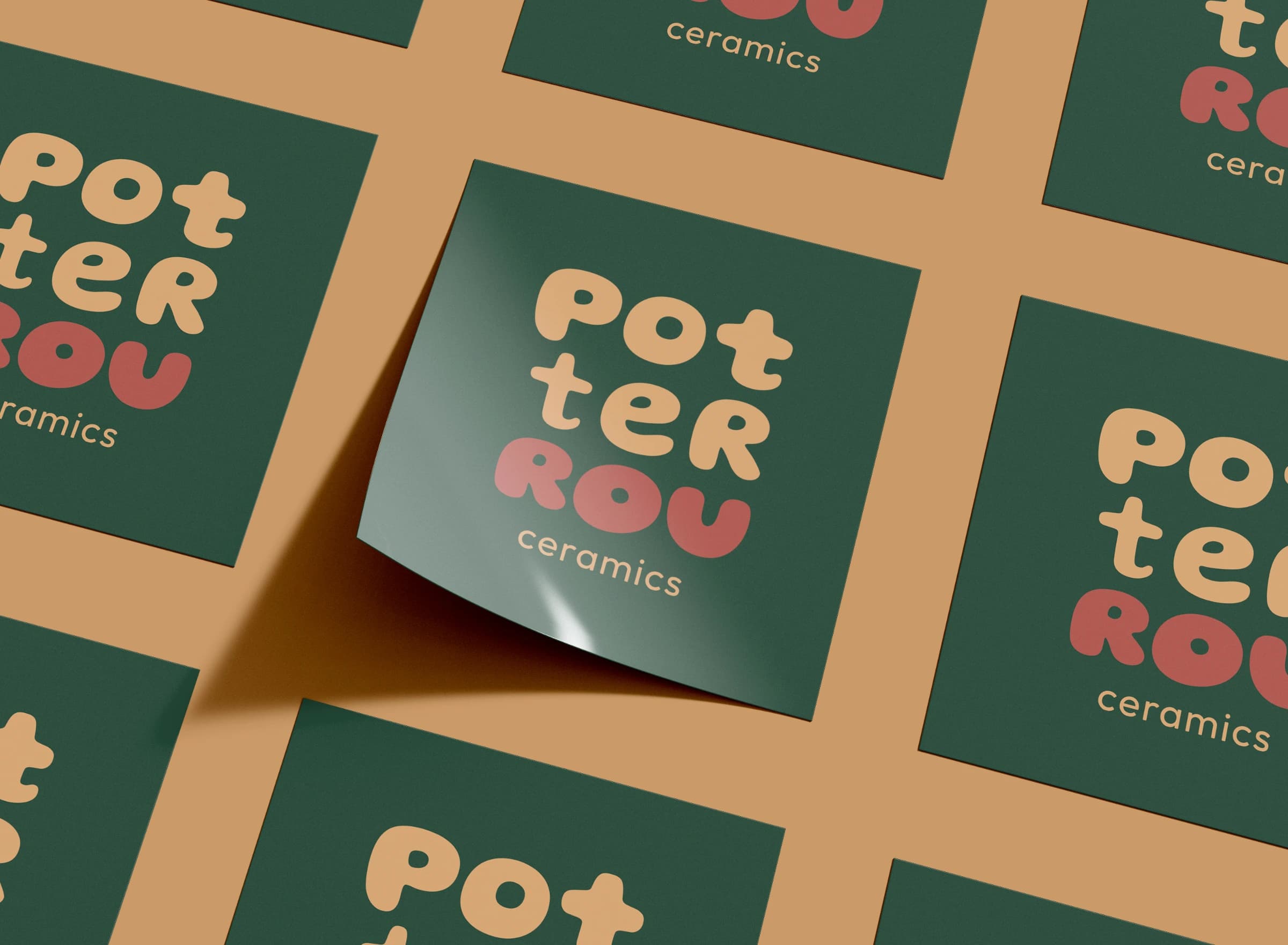
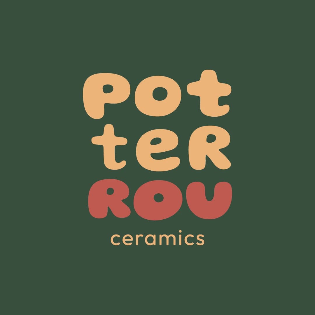
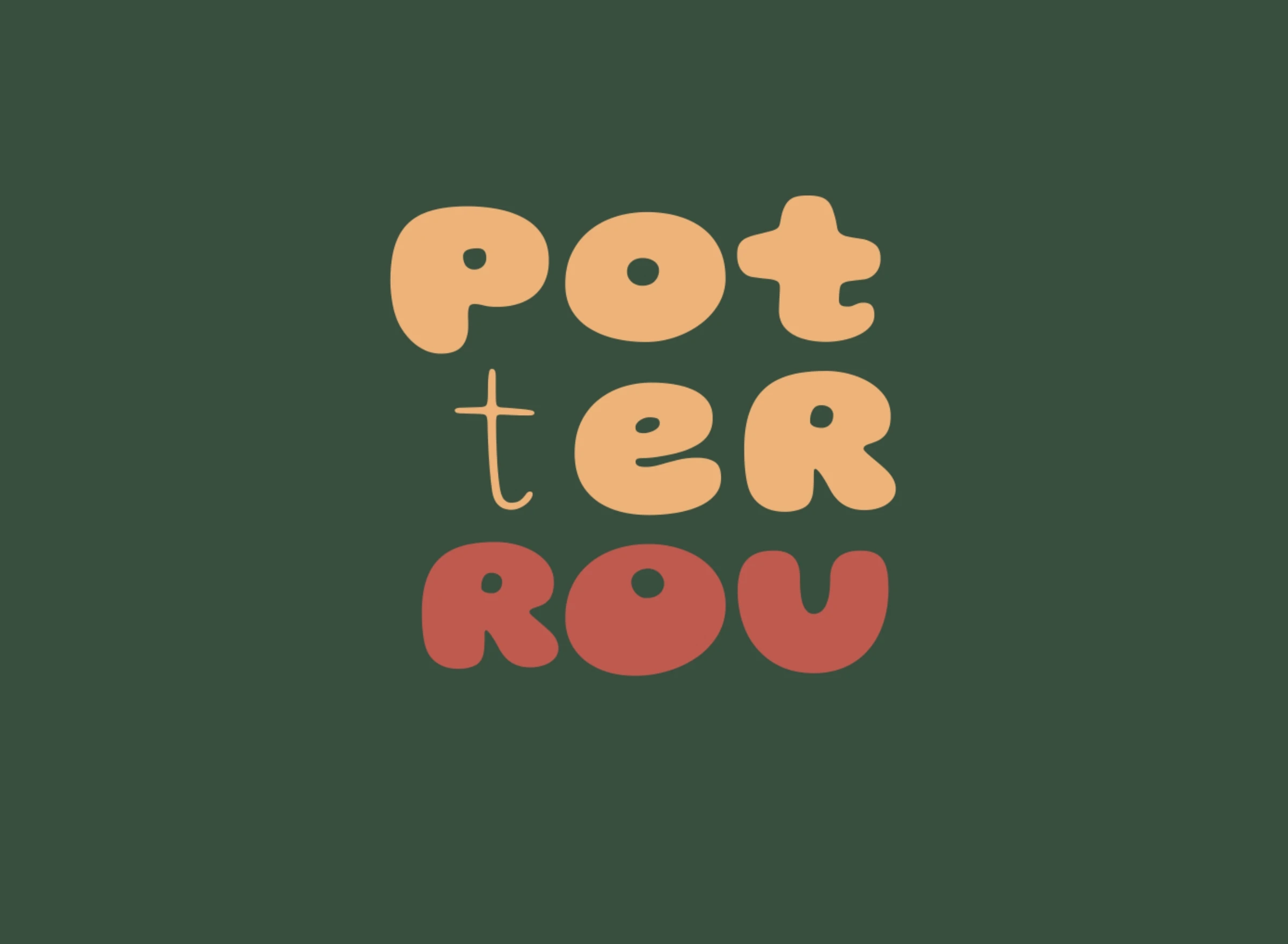
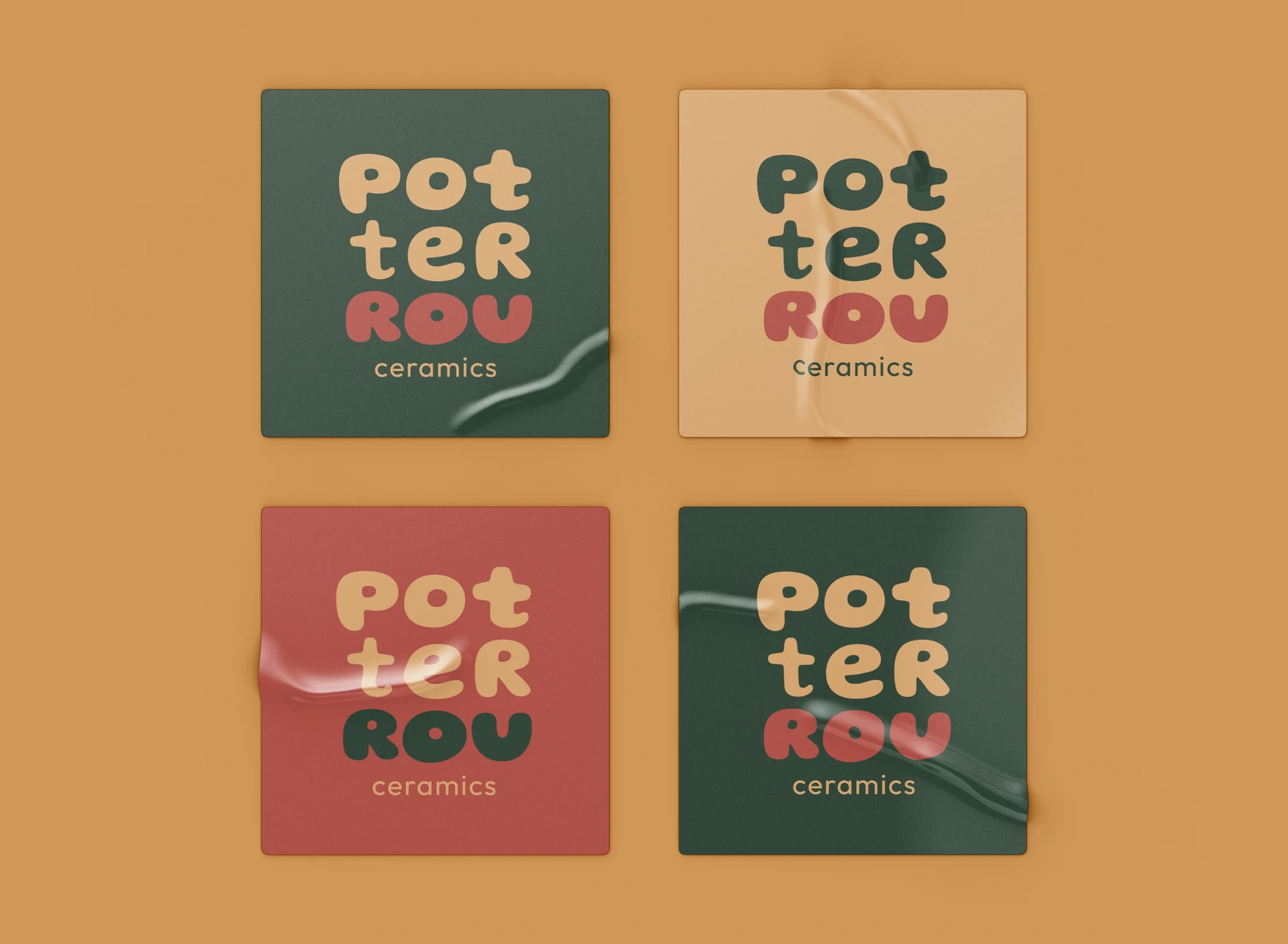
PotterRou is pottery and Rou put together, so I let the name stack up like pots on a shelf, with Rou sitting at the bottom in red.
At a glance
The identity for PotterRou, the ceramic studio of a potter known as Rou. I designed the logo, the palette and its animation.
The brief
It started with one of Rou’s pieces in my hands. It caught my eye, we got talking and a friendship began that’s still going. So when she needed a brand for her studio, she came to me. It had to feel like her work: warm, handmade and full of character, the kind of thing you want to pick up and turn around in your hands.
The idea
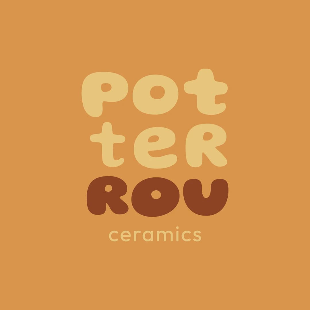
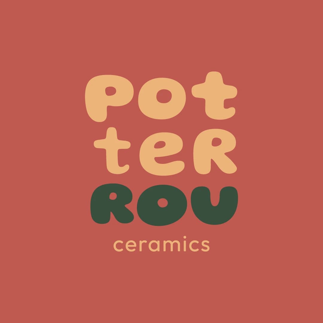
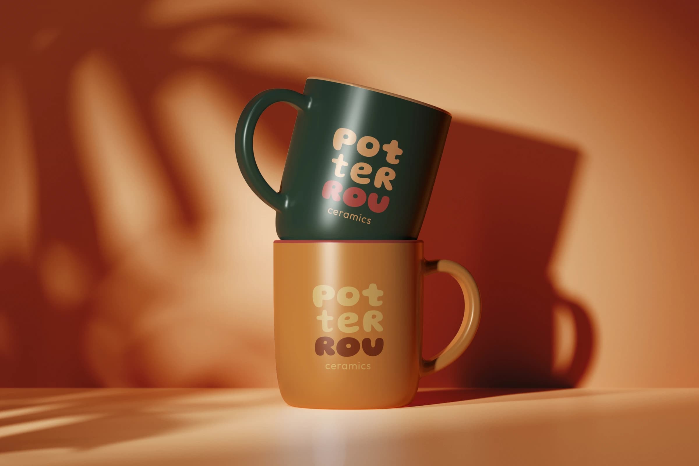
I split the name into its syllables, pot, ter and ROU, and set them in a round, soft typeface that looks almost thrown on the wheel. The palette comes from the clay and glazes of her own pieces. And then I let the letters play: in the animation they swap between thin and bold, as if someone were still shaping them on the wheel.
Project
- Client
- PotterRou · ceramic studio
- Industry
- Crafts
- Services
- Branding
- Role
- Graphic designer · brand identity
- Year
- 2024
- Team
- Freelance, working directly with the potter
- Palette
“At first glance it is simply a potter, and then Rou steps forward in red, and you know whose hands made the pots.”
The detail
I love how the name reads twice and how the letters transform as if Rou was shaping them on the wheel.
In production
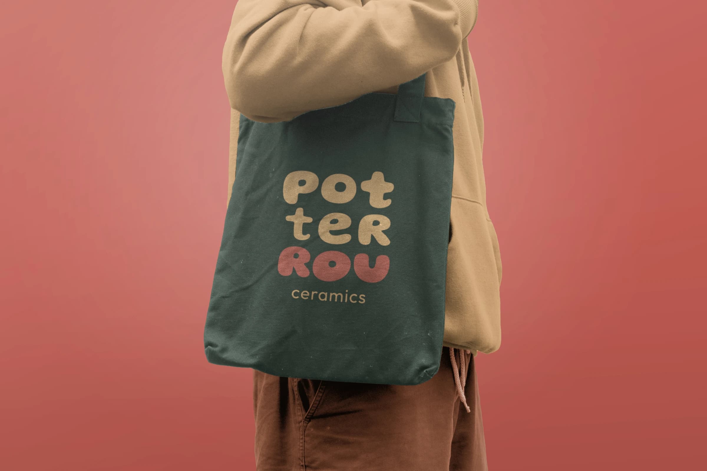
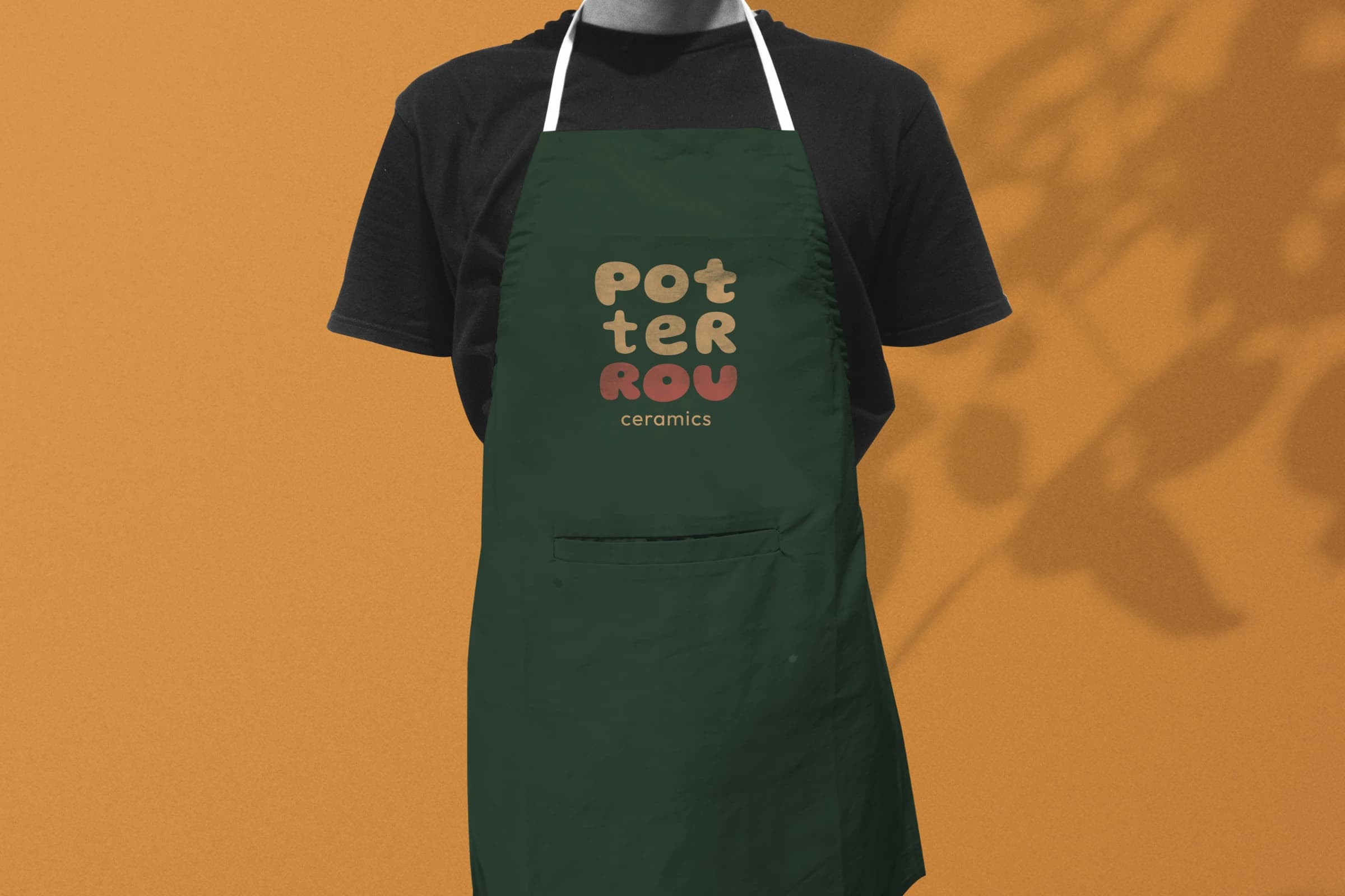
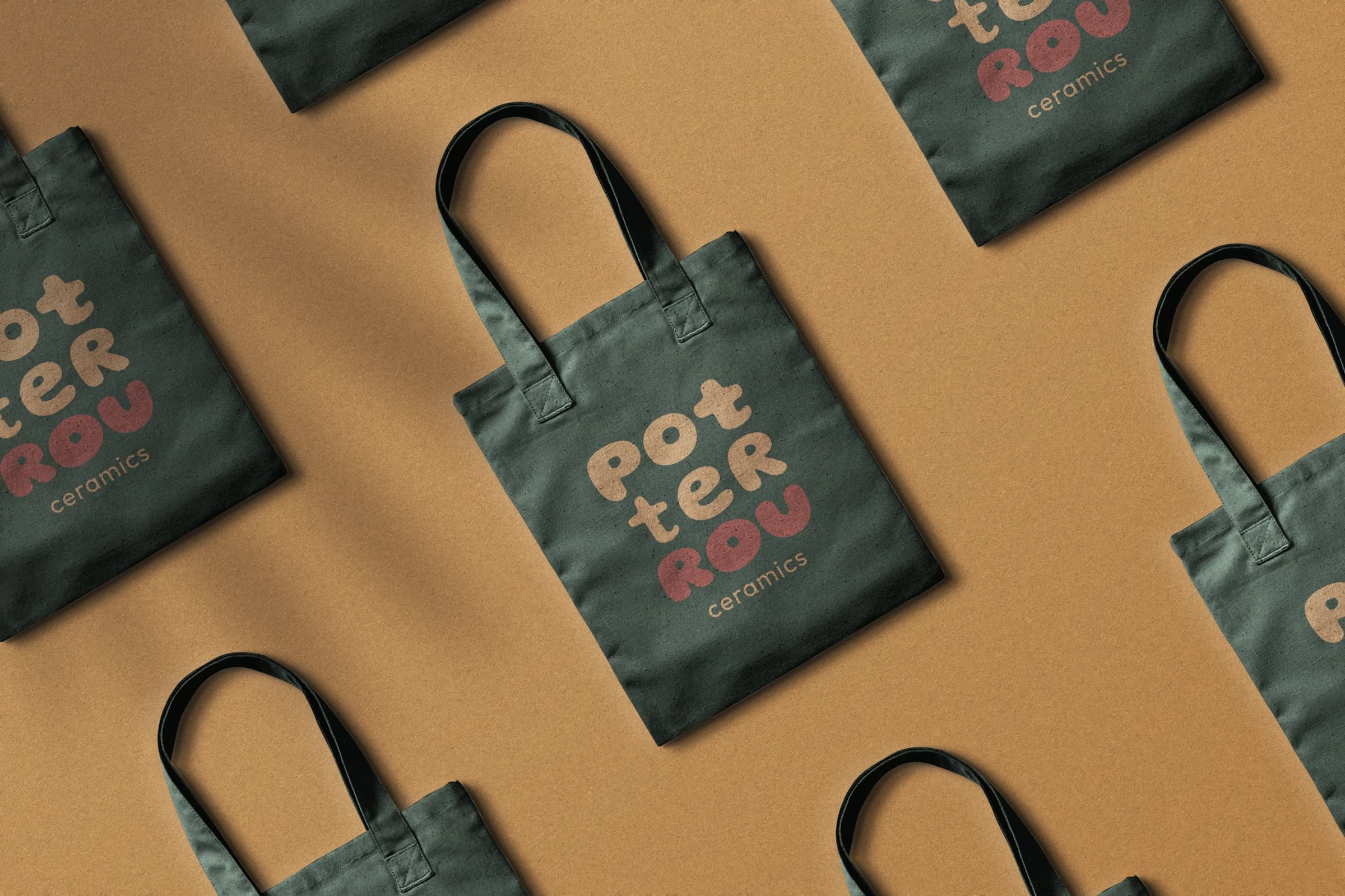
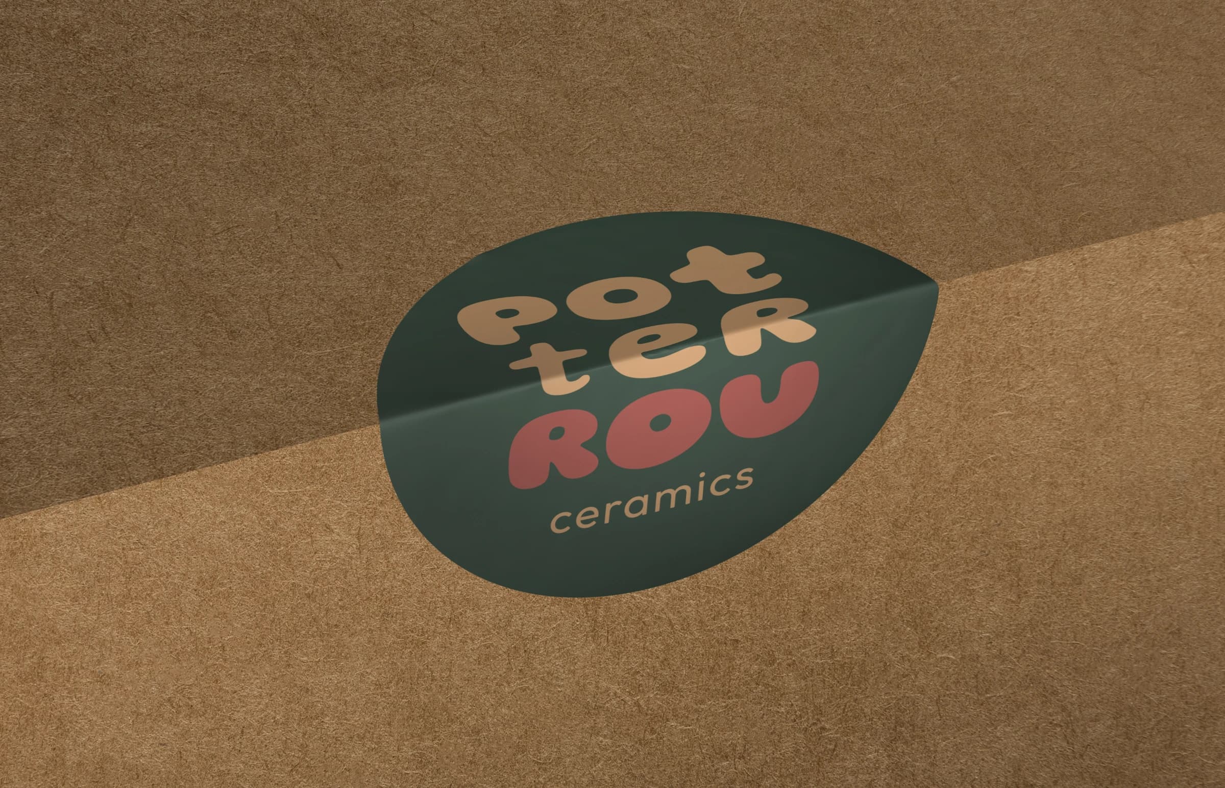
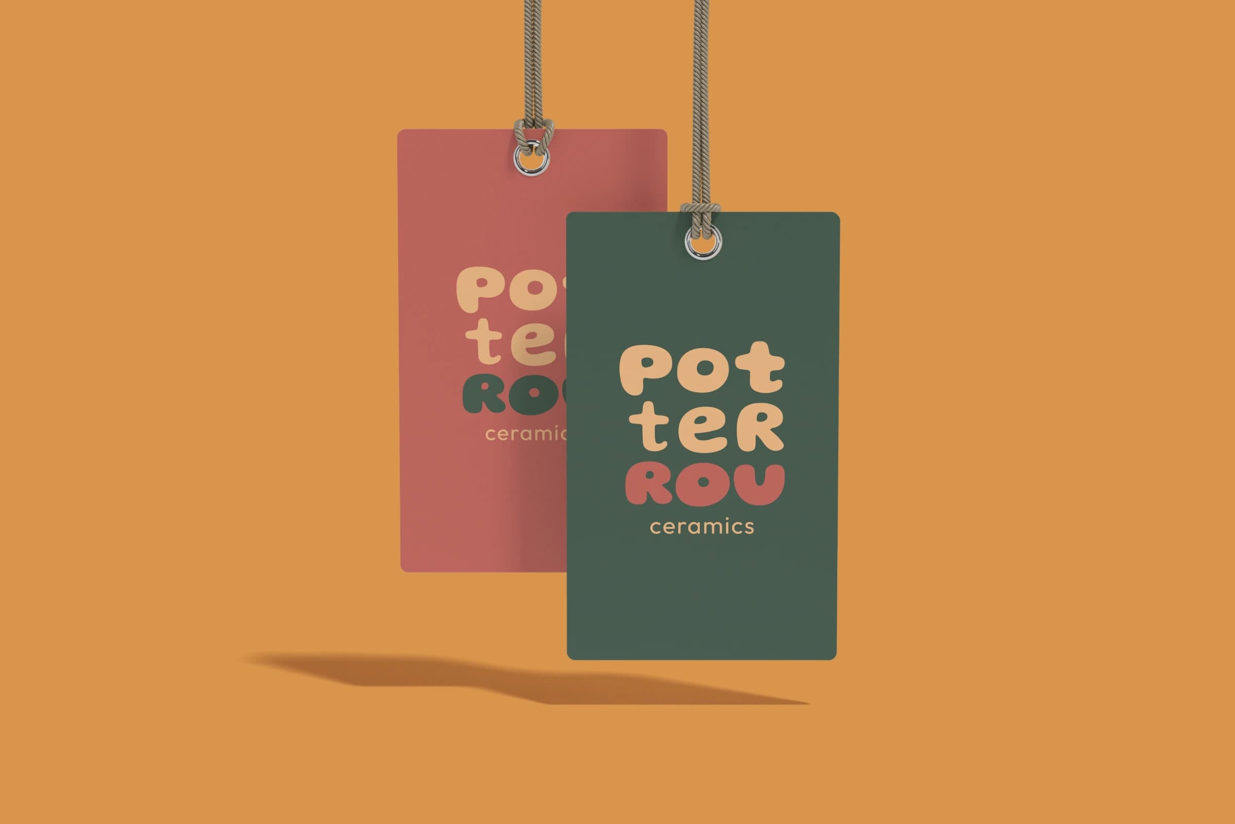
The logo went onto tote bags and aprons, and I went to the printers myself to make sure the colors on the fabric matched the ones on the pots.
Production notes
- 01Logo, typography, color palette and applications
- 02Palette taken from the clay and glazes of Rou’s own pieces
- 03Tote bags and aprons printed, with the production checked in person
- 04In use by the studio today
Since then
Rou still works under it today, on her bags, her aprons and next to every pot that leaves the studio.
Credits
- Rights
- © PotterRou