RE-BRANDING
Redesign of the corporate identity of the slovenian company ''Persi Angel'' that sells natural products and cosmetics.
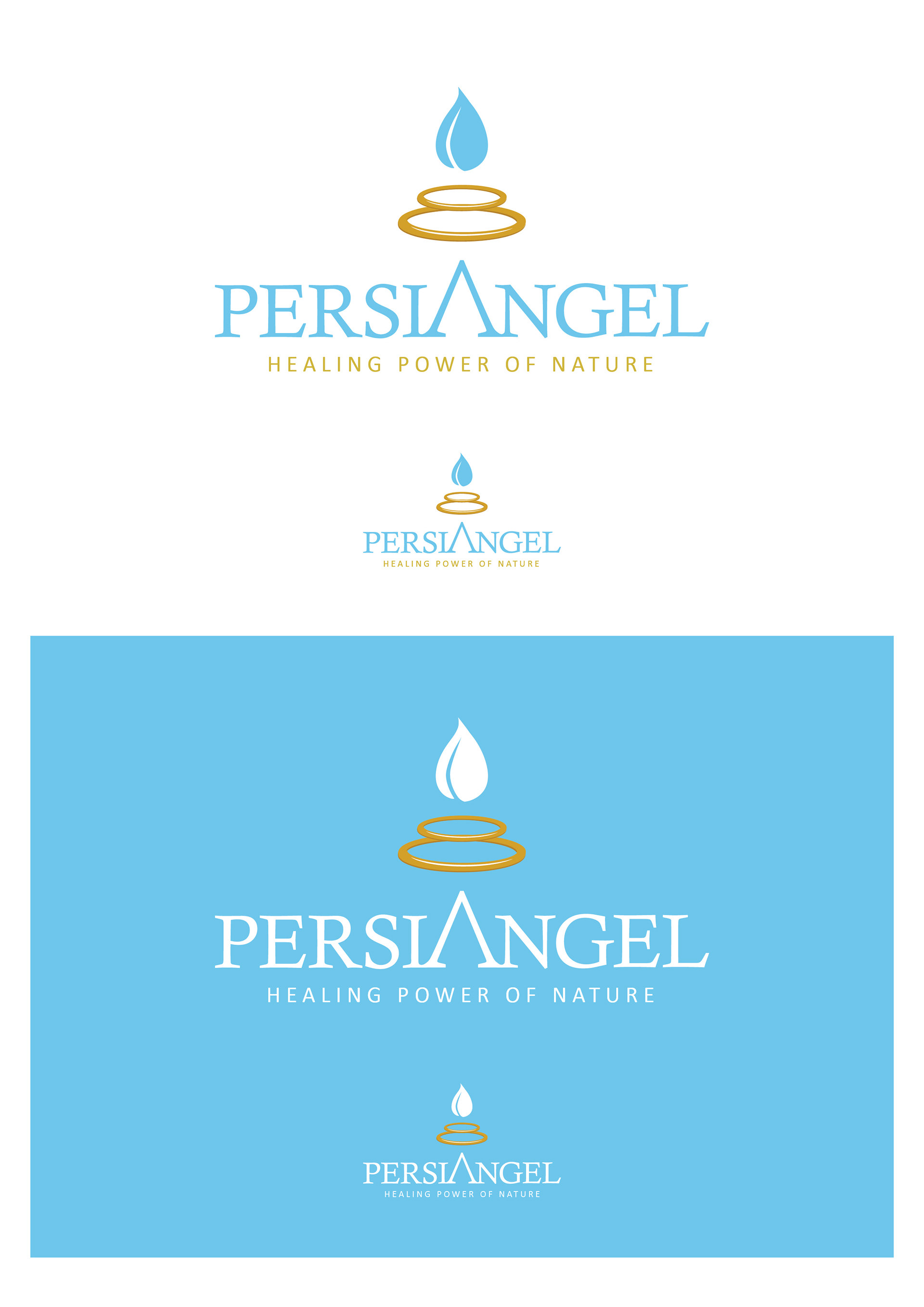
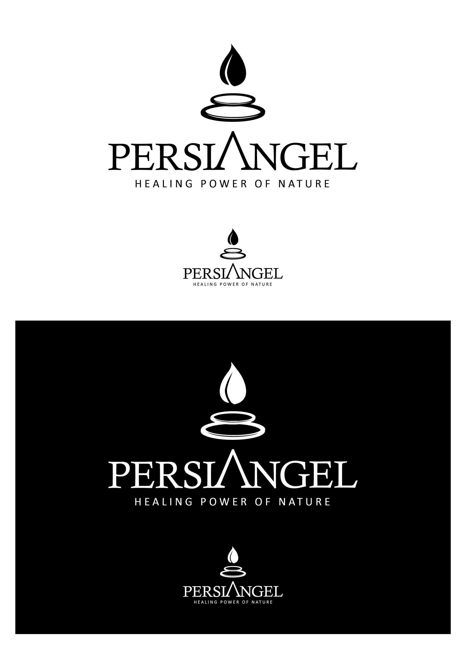
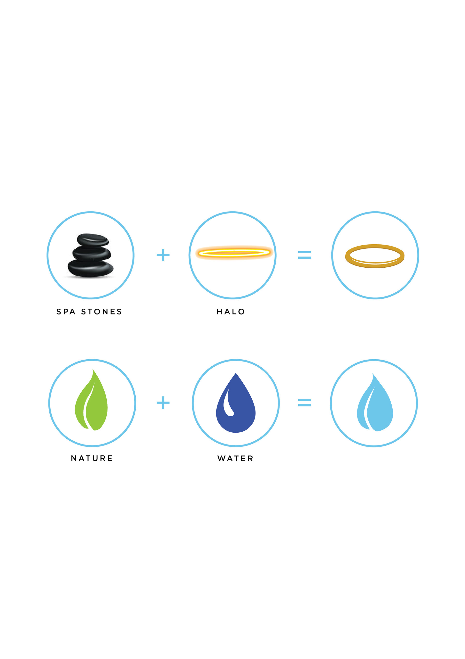
The logo represents the angelic love and care for humanity the company wants to offer to their clients with their product. The shape of the logo is representing a halo that also looks like a golden ring and that gives the escence of luxurity and premium quality. The drop is a combination of the shape of a real water drop and a leaf, which shows the natural consistance of the product made by minerals. The double shape of the halo-rings also remind us the black stones that use at the spa centers.
Case study I designed during my internship in Ljubljana, Slovenia at LONI DBS d.o.o. aka Bellini & Friends studio (2015-2016)
All rights reserved.
